
1. flexbox
이제부터 본격적으로 웹디자인을 담당하는 css에 대해서 배워볼려고 한다. flex는 contents 위주의 디자인이다. grid 처럼 위아래를 다루는 2d 방식의 form이 아니기 때문. 그리고 flex property는 웹창의 크기에 따라 유연하게 item이 변할 수 있게 해준다. 우선 flex.html을 만들어주자.
1
2
3
4
5
6
7
8
9
10
11
12
13
14
15
16
17
18
19
<!DOCTYPE html>
<html lang="en">
  <head>
    <meta charset="UTF-8" />
    <meta name="viewport" content="width = device-width, initial-scale = 1.0" />
    <link rel="stylesheet" href="flexbox.css" />
    <title>SCSS CLASS WITH NICO</title>
  </head>
  <body>
    <div class="parents">
      <div class="child">1</div>
      <div class="child">2</div>
      <div class="child">3</div>
      <div class="child">4</div>
      <div class="child">5</div>
      <div class="child">6</div>
    </div>
  </body>
</html>
그리고 css디자인을 적용해주기 위해 flexbox.css를 만들어주자.
1
2
3
4
5
6
7
8
9
10
11
12
13
14
15
16
17
18
19
20
21
22
23
24
25
26
27
28
29
30
31
32
33
34
35
36
37
38
39
40
41
42
43
44
45
46
47
48
49
50
51
52
53
54
55
56
.parents {
  display: flex;
  font-size: 50px;
  gap: 10px; /*모든 상자 사이의 틈을 설정한다. */
  flex-direction: column;
  justify-content: stretch;
  align-items: flex-end;
  flex-wrap: wrap;
  height: 100vh;
} /*flex 박스를 이용할때 항상 직계부모를 건드려야함. */
/* default direction: row
to modify the columns, use this property: align-items
to modify the row(defalut), use this property: justify-content

그리고 body의 높이를 늘려줘야 수정가능하다. 늘어날 공간이 필요하니깐(height: 100vh 로 해줌--화면을 100%활용함)


/* 그리고 flex-direction: column; 이면,..어떻게 설명해야하나. 화면이 90도 왼쪽으로 돌아갔다고 보면 된다
그럼 가로가 늘어나면 위아래가 늘어나는 것이고 세로가 늘어나면 왼쪽 오른쪽이 늘어나는 것이다. */

/* flex-wrap: wrap; 이라고 하면 item들이 밖으로 삐져나가거나 충돌하지 않도록 감싸준다고 생각하면 된다.
그래서 넘쳐 흐른 item 들이 밑으로 가게 된다. */

.child {
  height: 60px;
  width: 150px;
  display: flex;
  justify-content: center;
  align-items: flex-start;
  background-color: peru;
  color: blue;
}
/* child 에도 flex, justfy-content, align-items 를 적용할 수 있다.(그럼 숫자의 위치가 바뀌겠지.)
  flex-basis 는 default width 라고 생각하면 된다. 그리고 child 전체 클래스에 주로 적용된다. */

.child:nth-child(3) {
  align-self: flex-start;
}

/*특정 child 를 지정해서 modify 할 수 있는데 이때 align-self property를 사용한다. */

.child:nth-child(1) {
  order: 1;
}

/*관리자의 권한이 없어서 아니면 그 다른이유로 html 을 못바꿀때 order를 사용하면 순서를 바꿀 수 있다. 그리고 참고로
default order은 '0'이다. 그러므로 위의 코드에 의해서 첫번째 child가 제일 뒤로가게 된다.*/

.child:nth-child(2) {
  flex-shrink: 7;
  background: black;
  flex-grow: 3;
  flex-basis: 1;
}
/*이런식으로 하면 웹창이 줄어들때 그리고 늘어날때 2번 상자만 늘어났다 줄어들었다 한다. 다른상자에 비해
그리고 늘어날때와 줄어들때 빈칸이 없이 꽉차게 늘어나거나 줄어듬.*/
결과

3번째 child 가 맨앞쪽으로 향해있고 1번째 child가 order:1에 의해 가장 마지막에 위치해있는걸 확인할 수 있다.
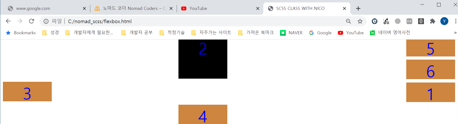
parents클래스에 부여된 flex-wrap: wrap; 때문에 화면이 줄어들어도 모든 item이 한 화면에 감싸지게 된다. 그리고 2번째 child에 부여된 shrink와 grow property 에 의해 혼자 더 늘어나고 더 줄어들게 된다.