
1. GRID
flex 와는 다르게 높이와 넓이를 설정할 수 있다. 쉽게 말해 표라고 보면 된다. 우선 몸풀기로 간단한 표 하나 만들어 보자. 역시나 html 파일을 하나 만들자.
1
2
3
4
5
6
7
8
9
10
11
12
13
14
15
16
17
<!DOCTYPE html>
<html lang="en">
  <head>
    <meta charset="UTF-8" />
    <meta name="viewport" content="width = device-width, initial-scale = 1.0" />
    <link rel="stylesheet" href="grid1.css" />
    <title>SCSS CLASS WITH NICO</title>
  </head>
  <body>
    <div class="parents">
      <div class="child">1</div>
      <div class="child">2</div>
      <div class="child">3</div>
      <div class="child">4</div>
    </div>
  </body>
</html>
그리고 위의 html 의 소스가 되는 css파일을 만들자.
1
2
3
4
5
6
7
8
9
10
11
12
13
14
15
16
17
.parents {
  display: grid;
  grid-template-columns: 250px 250px 250px 250px; /* 세로줄간의 간격. 또는 repeat(4, 250px) 라고 해도 된다. 개발자들은 반복을 싫어하다 못해 혐오하는 것 같다.  */
  grid-template-rows: 40px 180px 90px 150px; /*가로줄의 간격   */
  gap: 10px;
  height: 100vh; /*높이 설정하는거 역시 잊지 말자. */
}

.child {
  background: peru;
  color: blue;
  display: flex;
  justify-content: center;
  align-items: center;
  font-size: 25%;
  flex-basis: 30%;
}
결과
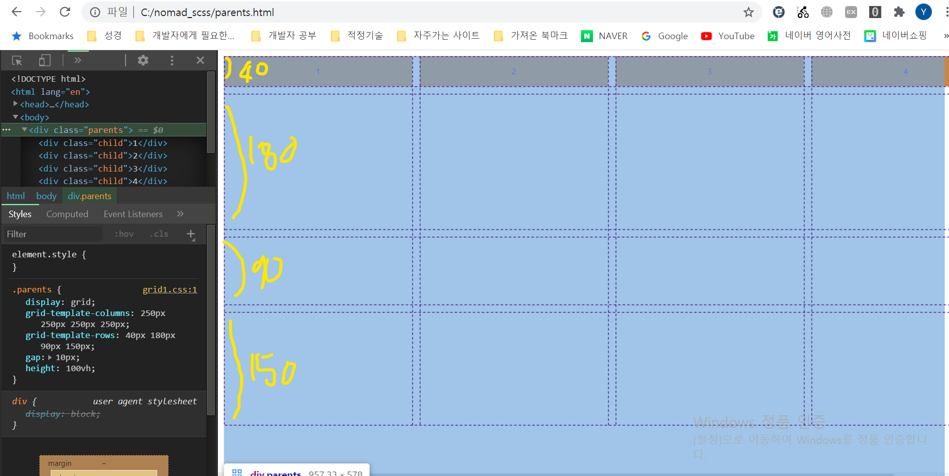
그리고 검사를 통해 grid 가 만들어진 걸 볼 수 있다.