
1. 좀더 flexible 한 웹을 위한 property.
이번엔 minmax, grid-auto-flow 등과 같이 창의 크기에 따라 item의 크기가 바뀌거나 또는 새로 들어오는 item을 자동으로 배열해주는 property를 배워볼 것이다. 역시나 html 을 우선 만들어주자.
1
2
3
4
5
6
7
8
9
10
11
12
13
14
15
16
17
18
19
20
21
22
23
24
25
26
27
28
29
30
31
32
33
34
35
36
37
38
39
40
41
42
<!DOCTYPE html>
<html lang="en">
  <head>
    <meta charset="UTF-8" />
    <meta name="viewport" content="width = device-width, initial-scale = 1.0" />
    <link rel="stylesheet" href="grid3.css" />
    <title>SCSS CLASS WITH NICO</title>
  </head>
  <body>
    auto-fill
    <div class="grid">
      <div class="item">1</div>
      <div class="item">2</div>
      <div class="item">3</div>
      <div class="item">4</div>
      <div class="item">5</div>
      <div class="item">6</div>
    </div>
    auto-fit
    <div class="grid">
      <div class="item">
        It is realllllllllllllllllllllllllllllly long words
      </div>
      <div class="item">
        It is realllllllllllllllllllllllllllllly long words
      </div>
      <div class="item">
        It is realllllllllllllllllllllllllllllly long words
      </div>
      <div class="item">
        It is realllllllllllllllllllllllllllllly long words
      </div>
      <div class="item">
        It is realllllllllllllllllllllllllllllly long words
      </div>
      <div class="item">it is moderate length of the word</div>
      <div class="item">it is short word</div>
    </div>
    <!-- 대박이다!! 만약에 item 이라는 클래스를 20개 만들고 싶고 안에 들어갈 값은 숫자이고 싶다고 하면
            다음 html 코드를 쓰면 됨. .item*20>{$}-->
  </body>
</html>
그리고 css를 만들어주자.
1
2
3
4
5
6
7
8
9
10
11
12
13
14
15
16
17
18
19
20
21
22
23
24
25
26
27
28
29
30
31
32
33
34
35
36
37
38
39
40
41
42
43
44
45
46
47
48
49
50
51
.grid {
  display: grid;
  gap: 5px;
  height: 50vh;
  grid-template-columns: repeat(5, minmax(100px, 1fr));
  grid-template-rows: repeat(4, 1fr);
  grid-auto-columns: 100px;

  /* justify-items: stretch; default 값
    align-items: stretch; default 값
    위의 두 property는 fraction 안에서도 구역을 나누어 얼마나 채워질지를 정할 수 있는 property 이다.*/

  /*place-items:
    end start;  위의 두 값을 다 합친 지름길이다. 앞에 값이 세로이고 뒤에가 가로값이다.
    justify-content: center; 이번에 배울 property는 grid 전체를 조정하는 코드이다
    align-content: center;
    place-content: end start; 마찬가지로 위에 두개를 한꺼번에 modify 한다.*/

  /*grid-auto-rows:
    grid-auto-rows: 100px; 라고 하면 마지막, grid fraction 을 초과하여 item이 외부에서 들어올 경우(초기에 설정해놓은 가로 세로 줄보다 더 많은 item을 말함)
    밑으로(row 방향으로) 100px의 그리드가 자동으로 생성되면서 item이 거기에 담기게 됨. 근데 만약 row 방향이 아닌 column 방향으로 item 이 생성되게 하고 싶다 할때는
    grid-auto-flow: columns; 라고 하면 옆으로 새로운아이템이 생성되는 방향이 옆으로 바뀜. */

  /*minmax:
    grid-template-columns: repeat(10, minmax(100px, 1fr)); 라고 하면 말그대로 최소가 100px 이고 최대가 1fr으로 설정하는 property 이다
    grid를 한층더 유연하게 만들어준다. */
}

.item:nth-child(odd) {
  background-color: honeydew;
} /*홀수번째 아이템을 모두 선택한것임 */

.item:nth-child(even) {
  background-color: indianred;
} /*짝수번째 아이템을 모두 선택한것임 */

.grid:first-child {
  grid-template-columns: repeat(auto-fill, minmax(100px, 1fr));
}

.grid:last-child {
  grid-template-columns: repeat(auto-fit, minmax(max-content, 500px));
} /* grid=class 가 2개있다고 하자. 그럼 첫번째 grid에만 효과를 주고 싶을때 .grid:first-child 라고 한다. 마지막은 last-child 라고 한다. */

/*이번엔 auto-fill 이랑 auto-fit에 대해 배워볼거다. auto-fill은 item이 자동채워지는 게 아닌, grid가 남은 스크린을 자동으로 채우는것이다.
auto-fit은 아이템이 스크린의 사이즈를 균일하게 배분받아서 크기가 설정된다. */

/* 마지막으로 배울 property는 min-content와 max-content 이다. min-content는 상자안에 item 크기가 작아질수있을만큼 작아지게 만든뒤

상자의 크기도 그 item의 크기만큼 줄이는것. max-content는 반대로 item의 크기를 최대로 키운다음 상자의 크기도 그만큼 키우는거다.
이 두개의 property는 minmax 와 repeat 와도 융합해서 쓸수 있다 */
결과
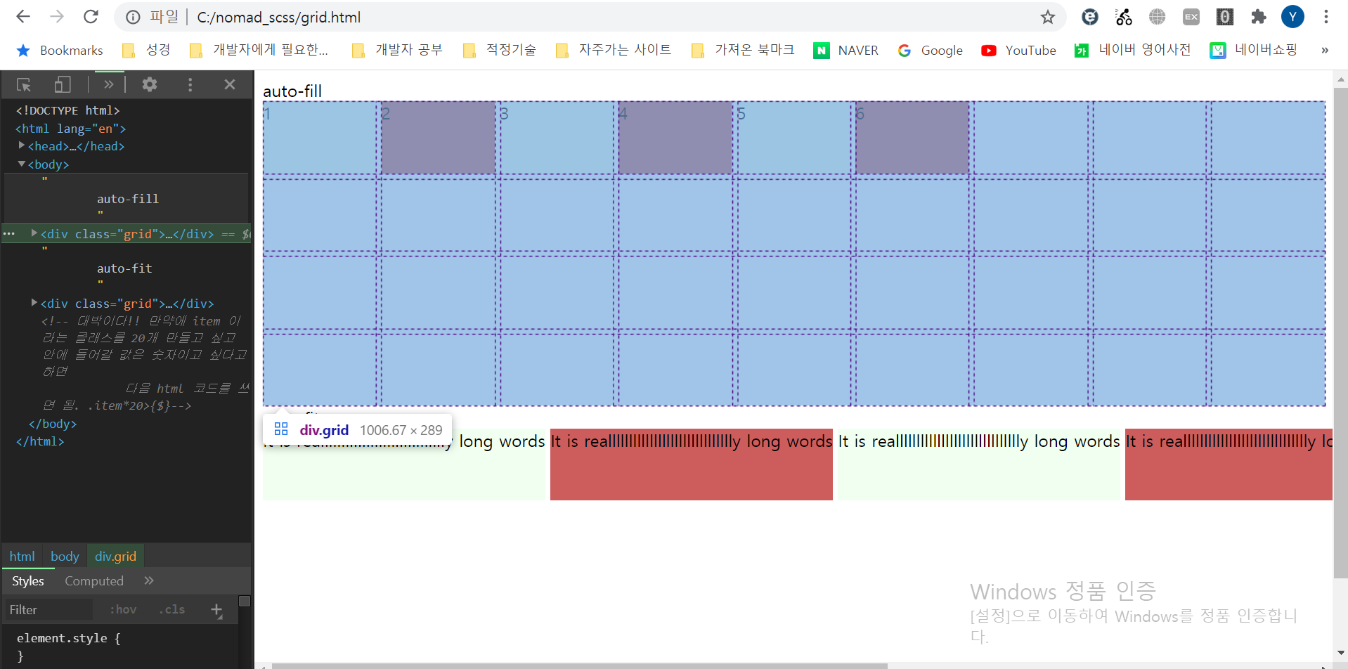
grid의 빈칸이 이미 준비되어있는 것을 볼 수 있다.(auto-fill)
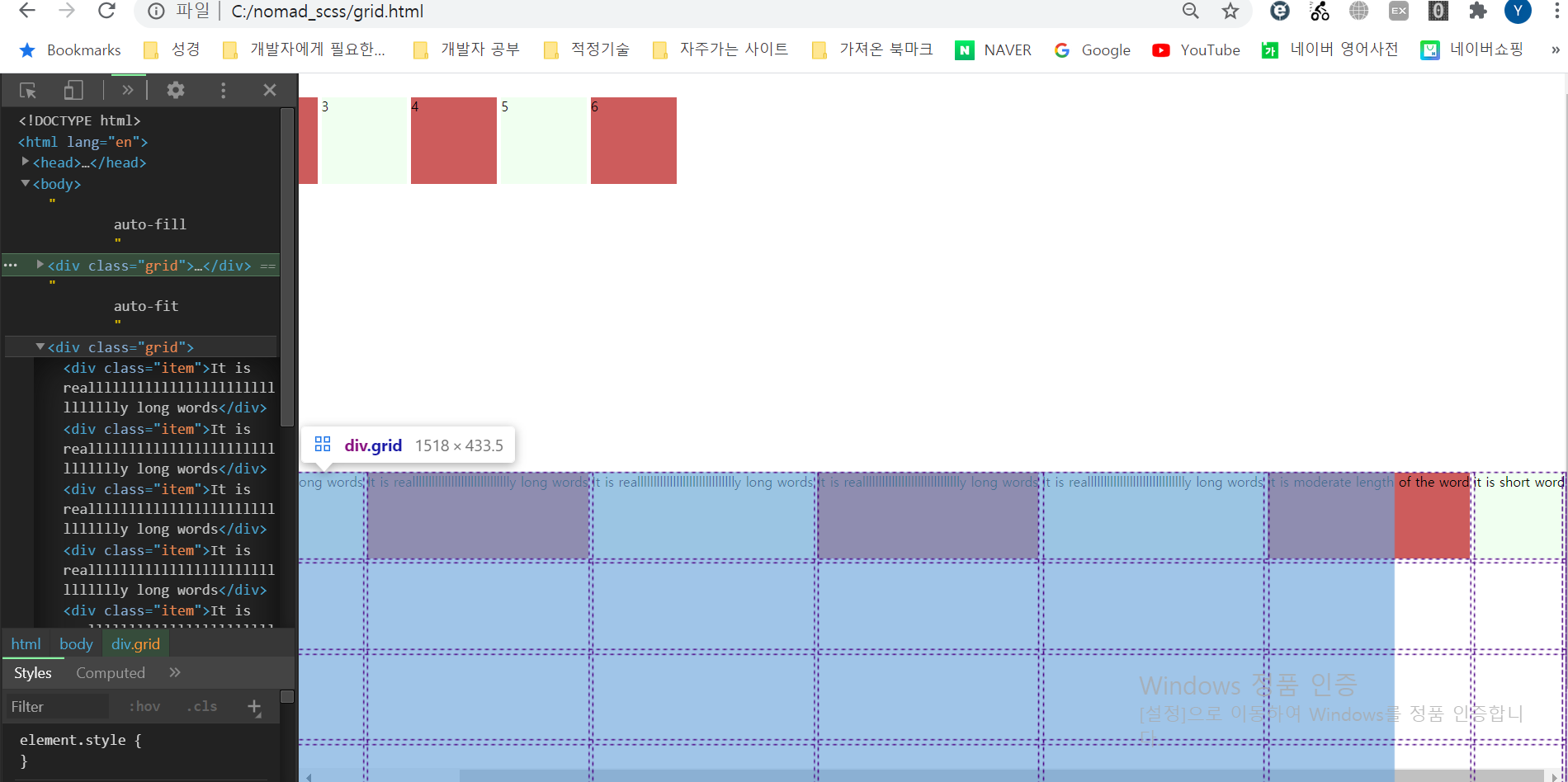
grid의 칸이 item으로 꽉차있는 걸 볼 수 있다.(auto-fit)
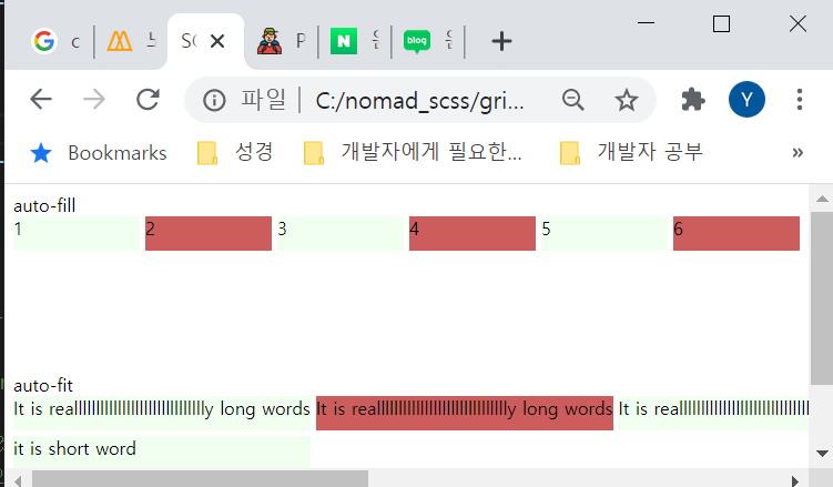
아무리 창을 작게해도 글자 크기보다 더 작아지진 않았다.(minmax(max-content, 500px))
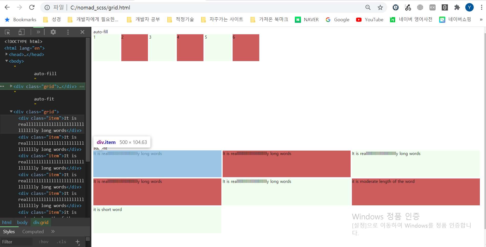
그리고 auto-fit 안에 있는 item들이 500px 이상으로 커지진 않는다.(minmax(max-content, 500px))